We've had the good fortune to speak to a number of CISOs across organizations, on the client level, within the sales funnel, and as contracted SMEs. Every day, CISOs and their teams are confronted with an absolute firehose of information, and there are myriad ways to slice that data, meaning that the software that can cut through the noise and present them with a jargon-free, opinionated set of to-dos will win the day. We've needed to clearly answer the question, "What do I need to do now?" for CISOs and their teams.
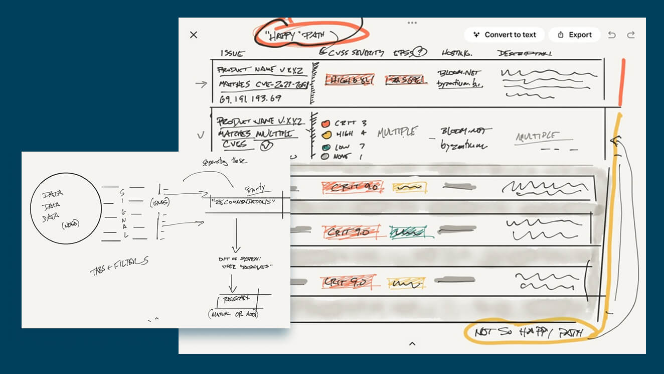
Early in the process, I wanted to try to get a handle on the various terminology in use already, and to try to refine it as best as possible. I'm a visual learner, so I usually get more mileage out of talking to colleagues and sketching while we talk.
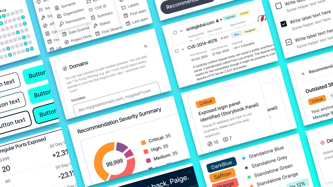
With the numerous ways of organizing and drawing attention to various pieces of data, it would be easy to overwhelm users in an arena where we’re supposed to be focusing their attention. For that reason, I decided to build mostly in the grey palette, using color, icons, and elevation sparingly to indicate status, severity, and important calls to action. Inter has proved to be a reasonable (and cost-effective) geometric typeface for our purposes; I especially appreciate the fairly wide characters and resulting legibility.
Iterating through new learnings
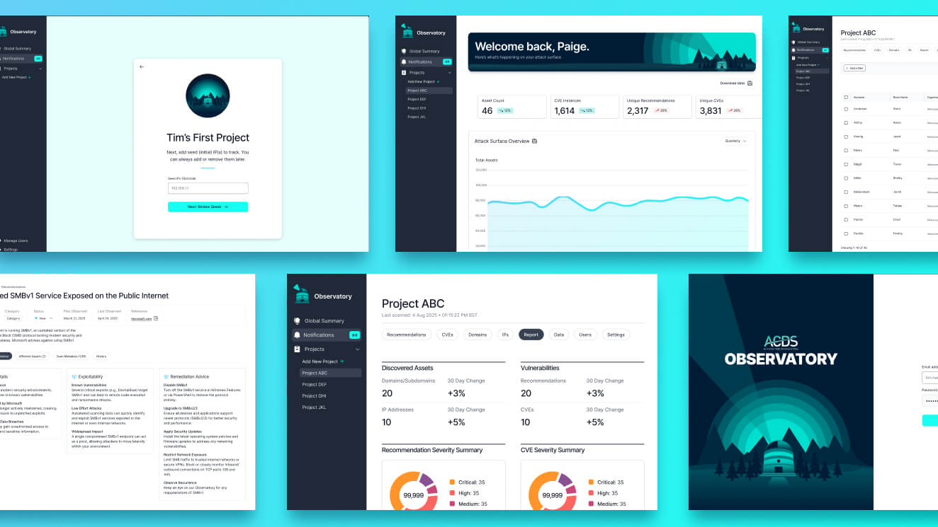
At this stage of product maturity, it’s important to design for the “now” while also keeping future flexibility in mind. For that reason, I’ve focused on modular designing, which our design system intentionally lends itself to.
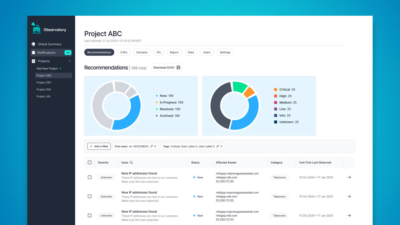
We operate from a model of “getting real data on the page” before we commit too heavily to a particular visualization solution: below, we realized that in our model, an “affected assets” list could number into the tens or even hundreds, so we needed to readjust and iterate through our initial lo-fi bet about the interaction pattern.